About Me

Mediasaurus is an A-Level media group from London which consists of two hardworking students who wish to demonstrate the research and production that goes into making music video. We will also be designing promotional material for the band as well as the CD cover. Our blog will be updated constanly and daily with posts throughout the academic year to show our progress. You can also follow us on twitter to see more recent updates at: http://twitter.com/TheMediasaurus

Like Us On Facebook!

Friday 22 October 2010

Designing Album Covers


Here is my version of Eminem's new album "Recovery". Eminem has a habit of reflecting his personal life into his album, so I chose to use a street in his hometown, Detroit. I chose a winter scene because I wanted to use the weather as a metaphor to translate the tough period in his life he has just come out from. Winter can be an unforgiving season with it's harsh colds but, also a season, for many religious people, of hope. I wanted to juxtapose Eminem's hardships and his recovery with the background image.  In the top left corner I used the original lettering for his album cover. I put it against a building to show more of a contrast with the colours, as it would not have been visible if I had put it on the sky. I used
 an outer glow around his figure to show a sign of new found strength, his rebirth and above all, his recovery.


This is album art for Tinie Tempah's new single "Written in the Stars". I chose to give it a space theme to play on the words of the song by including stars and using a background which features planets and meteors. I chose a picture of Tinie looking up so it was obvious for me where to put the stars as I could give the effect of him looking at the stars. Maybe to see what's written in the stars? I centred Tinie to make him the focal point of the cover. I also added the "Parental Advisory" certificate to make the album look more authentic. I wasn't too disappointed with the outcome considering this was my first attempt.


This album cover is my re-design to the Foo Fighters's album cover "Echoes, Silence, Patience & Grace". I changed the background to give it more of an Earthy tone with the leaf-like patterns. I kept the original image but, changed the font and the colour of the lettering. I did this so it doesn't contrast as much with the background image. I wanted to keep its simplicity as I enjoyed the original cover, so I made the decision to keep the simplicity in essence but, to also give it something different with the brush tool.


Friday 8 October 2010

Some Of Our Local Stars (London)


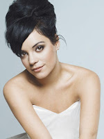
Lily Allen, born 2nd of May 1985 in Hammersmith is an English recording artist, talk show host and actress. From leaving school and creating a myspace for her demos, she signed with label 'Regal records' , created her first studio album and reached number one in the the UK singles chart with her first mainstream single "Smile".

Her second major album release, "It's Not Me, It's You", started a genre shift for Lily. Her music had a more electropop feel to it, rather than the ska and reggae influences of her previous album. The album debuted at #1 on the UK Albums Chart and the Australian ARIA Charts and was appreciated by the critics, noting the singer's musical evolution and maturity.


Jay Sean is another emerging star from London. He was born on March 26 1981 in Harlesden, Brent. He's a British Singer-songwriter who has recently signed to American Label "Cash Money Records". His American debut single "Down" topped the Billboard hot 10 making him the first solo artist of the South Asian origin to do so.

Jay Sean has confirmed he is working on a new album ( Freeze time), with the release date so far being set on November 2, 2010. He has stated that he has completed roughly 75 percent of the album and the guests so far include Lil Wayne, Pitbull, Nicki Minaj and Mary J. Blige


Bashy is a British hop/hop and grime artist as well as an actor, songwriter and a music supervisor. He was born in Chiswick, London on the 4th February 1985. At the age of 16, Bashy had already joined one of the top grime crews after he had the chance to know Major Ace. Bashy decided to go on solo due to some controversy but this turned out to be a good decision later on.

Working as an assistant music supervisor, Bashy was able to release a track for the film 'Adulthood' which became the theme track entitled to "Kidulthood to Adulthood". He also performed and wrote the theme song to the 2010 film 'Shank', called "When the Sky falls" which features Loick Essein.


Born on the 3rd April 1985 in Islington, London, Leona Lewis is not only a British pop and R&B singer but a songwriter too. She auditioned for the X-Factor one of the most popular TV shows and by winning it, it kick started her music career. She signed a contract worth 1 million with Simon Cowell and became a three-time Grammy award nominee and a multi-platinum selling artist.


In February 2007 Leona signed a £5 million five-album contract with Clive Davis in the US called "Spirit" and "Echo". Her debut single, "A Moment Like This" broke the world record on 20th December 2006 and was crowned the 2006 UK 'Christmas number-one single'. She was proclaimed 'Top New Artist" by 'Billboard magazine' in 2008.


British MC Skepta focuses on grime, hip-hopctro and electro alternative as his preferred genres. He's a rapper-songwriter and producer born in North London on the 19th of September 1982. His music career started through winning an MC battle against Tempa T in the final. He collaborated with brother and group member JME for his hit single,"Private Caller", which he had also produced  featuring his Meridian Crew.


Skepta, his partner JME & Wiley  began their grime label "Boy Better Know" in late 2005. The phrase was taken by both Skepta and JME and they released "Shut Yuh Mut"-Boy Better Know Edition 1, early year of 2006. Skepta released 'Greatest Hits' on September 2007 which was distributed nationwide.


Alexandra Burke was born on the 25th August in Islington, London. Not only is she a singer (R&B, soul, pop, electro) but also a songwriter, dancer and model.  Her singing career started after winning the 5th series of X-factor  in 2008. On the 13th February 2009, Alexandra signed a £3.5 million, five-album US record deal contract with 'Epic Records'.


Alexandra's first commerical single for her debut album is called "Bad Boys" ft Flo Rida. The single "Bad Boys" topped the UK Singles Chart on the 18th October 2009. "Bad Boys" was also certified a Platinum by the British Phonographic Industry on the 7th January 2010. Alexandra's single "Start without You" gained her fifth consecutive top ten hit, and her third number one single stormed to the top of the charts and beating Katy Perry for the top spot.

David Bowie was born on the 8th January 1947 at Brixton, London. His was into music of rock, glam rock, art rock and pop. David is a musician, singer-songwriter, record producer and actor. The instruments that he plays with are guitars, saxophone, piano/keyboard, drums etc. He was considered a very talented artist.

Bowie first cught the eye and ear of the public in July 1969, when his song "Space Oddity" reached top five of the UK singles chart. In 1975, Bowie achieved his first major American crossover success with the number-one single "Fame". He also had a UK number one in the 1980 with the single "Ashes to Ashes" and its parent album 'Scary Monsters (and Super Creeps).'


John Richard Deacon was born 19th August 1951 in Leicestershire, London. He is a musician and songwriter however a retired multi-instrumentalist, best known as the bass guitarist for the rock band 'Queen'. Mostly Deacon's compositions varied from pop rock to funk. He has been responsible for some of the Queen's biggest hits such as "You're My Best Friend" , "Another One Bites the Dust" and "I Want to Break Free".


Local Stars from our chosen music genre:


Jamie Alexander Treays was born January 8th 1986 in Wimbledon, South London. He both a songwriter and singer of post-punk revival, indie rock and Uk garage music. He uses intruments such as bass guitars and electric guitars. His stage name is Jamie T, and he also known as "Artic Monkey". He won best solo artist in 2007 at the Shockwave NME Awards defeating both Jarvis Cocker and Thom Yorke. He won again in February 2010 for the best solo act.


Jamie T's debut album "Panic Prevention" was shortlisted as one of the 12 nominees for the Mercury Prize. His singles "Shelia" and "If You Got The Money" received alot of airplay on XFM throughout 2006. "Shelia" was released on 29th July 2006. Two videos were made for this song; the first video in 2006 consisted of monkeys living in a house and short clips of Jamie Singing, whilst the second video in 2007 features actor Bob Hoskins walking along the River Thames lipsynching to the lyrics. On 16th October 2006, Jamie released his anthemic tune, "If You Got The Money" which reached 13 in the charts.


David Essex is an English musician, singer-songwriter and actor. He was born on July 23rd 1947 in Plaistow, England. He was interested in pop and musical theatre. In his early years he was was interested in playing the drums with a local band before becoming a singer. Since 1970s, David had attained nineteen top 40 singles in the UK (including two number ones), and sixteen top 40 albums.


His biggest hits during the 1970s included two UK number one singles; "Gonna Make You a Star" and "Hold Me Close". According to 'The Guinness Book of British Hit Singles'- he was voted the number one British male vocalist in 1974, and was a teen idol for more than a decade.

Marianne Evelyn Faithfull born on the 29th December 1946 in Hampstead, London is an award winning English singer, songwriter and actress whose career has spanned for five decades. Her early work in pop and rock music in the 1960s was overshadowed by her struggle with drug abuse in the 1970s. She was interested in the rock, pop, folk, jazz and blue genre of music and played instruments such as the keyboard.

Her first major release, "As Tears Go By", was penned by Jagger and it had become a chart success. She had then released a series of successful singles, including "This Little Bird", "Summer Nights" and "Come and Stay With Me".

Derek Boland born in Hammersmith, London on the 15th January 1965 was a rapper, songwriter and MC of the Hip Hop genre. He passed away at the age of fourty four on the 15th November 2009. His stage name was Derek B and his most commercially successful release were "Goodgrrove" and "Bad Young Brother" in 1988.

Derek B was the first UK rapper to achieve pop success, appearing on BBC Television's Top of the Pops. Following his chart of success, Derek B released singles and the album, "Bullet From a Gun". He received criticisms for rapping under an assumed American Accent, something which was popular in the early days of British Hip Hop, but was later abandoned.http://www.davidbowie.com/http://www.queenonline.com/

Tuesday 5 October 2010

CD/ Album Cover Analysis

The album cover serves three main purposes:
  1. To advertise and identify the contents of the music product.
  2. To convey the artistic aspirations of the original artists 
  3. In reproductions of the artwork, to serve as a primary image in the promotional efforts surrounding the product, as an identifiable image associated with it.
We begin our CD cover analysis with Eminem's s 6th studio album titled 'Relapse'. The cover shows pharmaceutical pills scattered into the shape of his face to show a personal insight to himself and take us through the troubles and hardships in his private life. Fighting his addiction to prescription drugs and checking out of rehab, he seems to have dedicated his album to one of the lower points of his life as well as his best friend Proof. The label in the bottom left resembles a doctor's prescription sticker to further emphasise the theme of the artwork and to show an inside joke as it states Doctor Dre prescribed the pills. Andre, more known as "Dr.Dre" produced most of the beats in the album. Die hard Eminem fans will instantly see the link between the graphics and the artist as Eminem has made a habbit of displaying personal issues in his art, whereas newer or less informed followers may struggle to see the concept behind the image.  Its genre is hip hop but notice the difference in the album art below of the same genre.


Kanye West collaborated with Japanese contemporary artist Takashi Murakami to influence the album art for his album Graduation. Murakami's surrealistic visual art is characterized by cartoon creatures that appear friendly and cheerful at first glance, but possess dark, twisted undertones. The album artwork expresses colorful, pastel imagery influenced by Murakami's affiliation with anime and manga.
The cover is based on Kanye's theme of student life. School. It's a place of dreams, of righteousness, a place to have fun. It's also occasionally a place where you experience the rigid dogma of the human race. Kanye's music scrapes sentimentality and aggressiveness together like sandpaper, and he uses his grooves to unleash this tornado that spins with the zeitgeist of the times. I too wanted to be swept up and spun around in that tornado.
—Takashi Murakami

The final image from the photoshoot for the album "Rated R" was shot by fashion photographer Ellen von Unwerth who stated that "Rihanna was looking to create something a bit new for the look of the album." The album cover was released on October 27 2009and features Rihanna in a glum state and contemplative pose, wearing a leather top with her hand covering her right eye, each finger being wrapped in an intricate set of rings. The black-and-white cover was compared to the outrageous 1980s album covers by singer Grace Jones. The genre of this album is R&B/ Pop so it goes against some of the conventions of its genre as well as a CD cover in general. The lack of colour and use of her name goes against what is typically expected in a Pop album and a CD cover in general. The"R" in the top right corner was designed as a two edge sword. One side symbolizes strength and the other vulnerability. This being Rihanna's most personal album to date, British artist and director Simon Henwood said he spoke with Rihanna extensively for months before the album's release.


This is the 10th studio album art for British electronic dance band, Pet Shop Boys. The album sleeve was designed by Mark Farrow & Pet Shop Boys. The cover features a large tick, taking up most of the space on the cover, and is made up of eleven different coloured squares. In the top left corner the text reads, in small font "Yes, Pet Shop Boys".The cover design was inspired by German artist Gerhard Richter. If you ever needed proof that less was more, it's right here because the album's cover was nominated in the 2010 Brit Insurance Design Awards shortlist in the Graphics category! Bold colours have arguably become a reocurring theme for the Pet Shop Boys as they have used them in 4 of 10 studio albums. The colours do compliment the music genre as it shows energy and vibe which is what we personally belive they were looking for in a conservative way, as the cover on a whole, isn't as energetic as you would expect it to be. What do you think? Give us you're opinions about the latest cover of  the most successful duo in UK music history.

Load is the sixth studio album by the American heavy metal band Metallica. It marked the first appearance of a new Metallica logo.The first and last letter of the name had rounded off its edges greatly simplyfying the appearance from the previous 1980's logo. The cover of the album is original artwork by Andres Serrano who has become notorious for his controversial work. This peice in particular, entitled "Semen and Blood III", is one of three photographic studies by Andres Serrano created in 1990 by mingling the artist's own semen and bovine blood between two sheets of Plexiglas. James Hetfield, lead vocalist had this to say about the cover in a 2009 interview with Classic Rock magazine:
"Lars and Kirk were very into abstract art, pretending they were gay. I think they knew it bugged me. It was a statement around all that. I love art, but not for the sake of shocking others. I think the cover of Load was just a piss-take around all that. I just went along with the make-up and all of this crazy, stupid shit that they felt they needed to do."
Infinity on High was released on February 5th, 2007. Its the fourth album by an American rock band named the Fall Out Boy. I chose this album CD Cover as it attracted me due to its unique design which i find quite clever. The title is taken from a letter written by Vincent van Gogh to his brother Theo in 1888, in which he describes his renewed health and the vigor it has instilled in his painting. Van Gogh's exact phrasing has been translated as "Be clearly aware of the stars and infinity on high. Then life seems almost enchanted after all". The clock on the wall could also be related back to the title as the world 'infinity' means never ending is parallel to time being infinite.
My own interpretation of the album cover is that it portrays a conflict between religion (life) and death. This is because the moon is presented and this a symbolic in both Islam and Christianity  as being a way of  guidance which if interpreted by a religious critic is a guidance to God. The lamb is also a symbolic figure in the Jewish religion as lambs were used as a sin offering in the Temple. In Christianity however, Jesus is considered "The Lamb of God" who was given as a one-time sacrifice for all, he was also known as a "shepherd". Furthermore, the wings on the lamb could signify it flying to heaven. Continuing the religious analysis of the album cover, a black crow placed in the corner in the Victorian and middle-eastern cultures would symbolize its presence as a sign of bad luck and even death. And as the black crow is standing on a pumpkin patch which is usually seen during Halloween which is known to celebrate death and the evil spirits. This album cover signifies a clash between the two beliefs. Books are placed behind the lamb's legs and this could be a symbolism of knowledge and this could be interpreted as the knowledge from God. The red cloth however could symbolize blood which relates back to the whole idea of death. The location seems to be set in a child's bedroom which ties in with the notion of innocence, the open door shows a lttle room which in my opinion is a way of distinguishing the two different worlds. The real world which is behind the door and the "after-life".


This album produced by Butch Vig was regarded as the best rock album of all time. It was released in September 1991 and became an unexpected huge success in late 1991 due to the popularity of its single, "Smells Like Teen Spirit". Nirvana's Nevermind is a well-produced yet emotionally raw album. Nevermind had restored the gritty passion, rebellious mentality and cathartic power long missing from mainstream rock. 
I interpreted this epic album cover as a message stating that from a very young age we humans have innate attraction to money, wealth and fame. This idea reveals what sort of world we live in, where 'every man for themselves' however placing a little child on the album indicates innocence and this reveals a conflict between the two. The colour blue  in many diverse cultures signifies in religious beliefs as a peace bringer, or is believed to keep the bad spirits away. Another interpretation of the colour blue could be related to 'feeling blue' or 'getting the blues' which represents the extremes of the calm feelings associated with blue i.e. sadness, depression, lack of strong (violent) emotion. 
Though the album may seem simple it still has so much to say.


Crazy Town is a rap rock band which originated in Los Angeles. Their first album The Gift of Game was released on November 9th, 1999. The girl licking the lollipop on the cover of the album is a fictional character created by Crazy Town, known as "Little Lolita". Both the album title and the picture of Little Lolita are based on lyrics from the song "Lollipop Porn". The album cover was designed by co-lead singer Shifty Shellshock's father and uncle.
The album shows conflict between what is pure and innocent i.e. butterfly tattoo, halo, ponytails and a lollipop and what is contaminated and devilish i.e. lightning tattoos, devil horns, evil smile, pierced tongue, and tattoo's on her fingers. The plain black background is a conflicting connotation. It can be either serious and conventional or mysterious, sexy and the album cover portrays both these characteristics.

Finding Beauty in Negative Spaces is the fourth studio album by a South African band. The album was released on October 19, 2007 and worldwide on October 23, 2007.  The cover artwork was designed by David Ho, the same artist who designed theVicious Delicious cover for Infected Mushroom. The covers apparently display the same character: Candice the Ghost. 
My interpretation to this unique design contains many factors such as innocence- due to the use of the little girl aswell as sadness, depression and emptiness. The lack of bright colours emphasizes the gloomy atmosphere which David Ho is trying portray. The skeleton that has replaced the character (Candice the Ghost's body states from a religious prespective that there is no life after death and that all dead bodies remain in ghost form after they die which parrelles that story of Candice the Ghost whereby the little girl dies from falling off a tree and lieing there in the bright sun. Another interpretation as to why her body is in a skeleton form is to emphasis her body decaying from the heat of the sun, which is a very painful and slow death for a young innocent girl.


Analysis of CD Covers of our chosen music genre:


Name of poster: The art of rock poster from Presley to punk


This is a rock genre poster which is quite catching. The focus of just the characters head on fire adds to the interpretation that all rock fans/folks are considered "hot headed" and therefore seen as aggressive and quite short tempered (stereotypical beliefs) or it can symbolize the passion flaring out of the character presented. Having a purple background juxtaposes the image as it symbolizes calmness and good judgment. Having the character in blue also conflicts the idea of anger as the colour blue symbolizes calmness. Its due to these conflictions that adds to the beauty of the poster.  

The title of the poster is quite striking as its bold and works well with the dark coloured background allowing the white to stand out against the red colour. The font in which was used is quite artistic which adds more class into the poster making it seem more professional. Having the title of the works in block capitals allows the title to be read easily and adds to the whole concept of catching the attention of the audience. 

Name of poster: Green Day Poster

This punk genre poster is really quite unique as it allows different interpretations to be made. Some would interpret the image of the hand holding the heart as having control over other's lives, and this could be referred to the Americans as shown in the title "American idiot". Both the song title and the heart are in red symbolizing the Americans passion of having control or death. The clever use of having the heart as a shape of a grenade could be interpreted as life being precious and it could end in any given moment or it can be interpreted as others such as the Americans for example having control over our lives and are so powerful that they are able to end our lives in an instant. The use of colours are quite effective, the black background allows the red and white to stand out attracting the audiences attention. Black symbolizes evil, power, anger and this is seen through the image of the hand holding a bleeding heart.

 The title of the poster "Green Day" is quite catchy as its in bold and in written in block capitals. Having one word in each line could be interpreted as allowing the chance for the audience to read each word without being confused and to allow consolidation of information adding more value to the poster. Here again their is a use of white in the title which we have noticed is quite common with punk posters. The use of the black background and white writing could stand for mourning and cheerless occasions. Other interpretations and symbolisms can be made with the use of black and white; black for the loss, and white for their passing onto the heavens as the colour of white symbolizes purity as its a sacred colour.  However the red used in "american idiot" could symbolizes aggression, love, blood. The colour red and white are usually worn by shrine maidens which again can be linked to God. Even though "american idiot" is not written in block capitals it still is rather catchy and is easily visible. 

While we were researching posters and CD covers we came to realise that most of them are quite similar in terms of colours that the titles are used. From the posters that we have posted above a trend of having white coloured titles or black seems to be quite important as they are seen as the fundamental colours and are more likely to stand out and grab the audiences attention. It is due to this we have decided to use this idea and use it when we create our own CD Covers and Poster promoting our music video.


Monday 4 October 2010

Print Studio Exhibition


About John Phillips- Grove Groove graphics studio:
John Phillips was born in the year of 1968, during the Vietnam War (where a lot of students protested) and during the student demonstration in Paris. Due to his past experiences he didn’t think he would be employable and didn’t think he could hold down a proper job so he decided to open an art studio/ gallery. This was because he had a keen interest in arts from different cultures. He also decided to start up a graphics studio as he was influenced by thoughts, music and culture. His fascination about different cultures was due to how different cultures intertwine and the different languages that were spoken from all over the world.
Groove grove studio works for the charity and is committed to engage activities with the local area and for the less privileged. John runs projects in the local community to allow public of all statutes and class to take part and contribute their ideas to art. John is anti-hegemonic, meaning that he believes that everyone is equal and thus should be treated so.
 

The studio took up to 35years to become the place it is now and he would not like to have any more studios as he believes that the graphics studio would loose the unique effect that it brings to the community. The Groove grove studio was successful as its art pieces made sense to the local people as they were able to reflect the images to their own lives. This is what attracted John to create a graphics studio as the idea of images having an affect on people’s lives in similar and different ways was intriguing to him. Even though the graphics studio was successful, it still loses money from prints and buying art work but gains the money through charity and people buying their art to subsidies the costs.

Questions asked to John Phillips:
    What was the most expensive art piece that you brought?
  ‘’The most expensive art piece that the graphics studio holds costs £20.00.”
    Where do you usually obtain these art pieces
“The pieces are mostly brought from e-bay and are then placed onto the studio walls.”
If we were to take your i-pod. What sort of music genres would we find?
“You would find; reggae, folk, rock, calypso, classical music and ska. I’m interested in all sorts of music genres, to be honest.  But I prefer music that I could relate to and has a rhythm too as well.”

The different categories at graphics studio
· All you need is love.
· War in Babylonian (ideas of conflict).
· Sex, d rugs and rock n roll,
John stated that ‘Big mama’ Thorntan invented the name and idea of rock n roll.

References that John Phillips made:
· Collin (1950)- who had an insight into magic, culture, fashion etc. Collin was one of the many inspirations to John.
· Black Art Studio: Bob Marley with Lee Scratch both came up with reggae.
Their song “Catch a fire"ceased to be a reggae artist and became a national star.
· Drugs were a common thing that were taken by musical artists;
     -Jazz artists took heroine
     -Hippies took LSD, Ecstasy and Marijuana
· Beatle’s song. Played live in BBC studio, first time mass audience around 12 million people.
· London Calling” sung by Freddie Madball
· Stravinksky- “The rite of Spring”- John stated that the image of the young girl dancing herself to death attracted him to the music.
· Caetano Veloso- “London, London” album. This was quite inspirational for John as he has a keen interest in culture and this album is about Veloso being lonely and miserable because he is away from his friends. He’s being pulled up from his roots.
· Plastic Beach” by the Gorillas
· Be-Bop-Jazz orchestra- This was John’s favorite as the artist was quite weird as he believed that he was born on Saturn. He was an artist that influenced other artists with his work.
· The Art Movement- Tropicalismo. It was full of colour and vibrant and this attracted John so much as it represented the Brazilian culture.