
Here is my version of Eminem's new album "Recovery". Eminem has a habit of reflecting his personal life into his album, so I chose to use a street in his hometown, Detroit. I chose a winter scene because I wanted to use the weather as a metaphor to translate the tough period in his life he has just come out from. Winter can be an unforgiving season with it's harsh colds but, also a season, for many religious people, of hope. I wanted to juxtapose Eminem's hardships and his recovery with the background image. In the top left corner I used the original lettering for his album cover. I put it against a building to show more of a contrast with the colours, as it would not have been visible if I had put it on the sky. I used
an outer glow around his figure to show a sign of new found strength, his rebirth and above all, his recovery.

This is album art for Tinie Tempah's new single "Written in the Stars". I chose to give it a space theme to play on the words of the song by including stars and using a background which features planets and meteors. I chose a picture of Tinie looking up so it was obvious for me where to put the stars as I could give the effect of him looking at the stars. Maybe to see what's written in the stars? I centred Tinie to make him the focal point of the cover. I also added the "Parental Advisory" certificate to make the album look more authentic. I wasn't too disappointed with the outcome considering this was my first attempt.

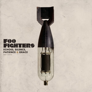
This album cover is my re-design to the Foo Fighters's album cover "Echoes, Silence, Patience & Grace". I changed the background to give it more of an Earthy tone with the leaf-like patterns. I kept the original image but, changed the font and the colour of the lettering. I did this so it doesn't contrast as much with the background image. I wanted to keep its simplicity as I enjoyed the original cover, so I made the decision to keep the simplicity in essence but, to also give it something different with the brush tool.
No comments:
Post a Comment